THE COLOUR TRENDS FOR 2020+ AND THEIR DRIVERS
COLOUR ANALYSIS
This year’s breakdown of colours has shifted from more chromatic, darker and dramatic colour areas, towards more soft yet powerful nuances. Reflecting the new consciousness.
To identify important colour groups and to show key directions, the NCS Triangle and NCS Circle are used to illustrate the colour movements – between 2019 and 2020 and onwards.
The illustration shows how the palettes are shifting from a mix of chromatic and vivid colours toward a mix of warm brown and beige shades, warm red and key colours such as a variation of lush greens and blues.
THE COLOUR TRENDS FOR 2020+
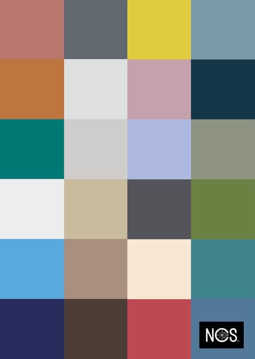
Year 2020+ marks the beggining of a new conscious wolrd. A time that is all about a circular approach, integrity, artificial intelligence and being human.
CONSCIOUSNESS is the key word of NCS Colour Trends 2020+ as we introduce four dominating trends based on the most important drivers of today, both independent and interdependent.
It is an interesting mix of colours that is not only reflects a new type of era that begins 2020, but the important groups of colours for the years to come.
The colour direction for the coming season’s interior colour trends is less bold. Instead they have moved toward a less chromatic area creating a conscious mix of toned-down hues of washed-out pastels, warm greys and rich blues.
Translated into NCS Notations, NCS Colour Trends 2020+ gives you the most important colours to keep track off – presented in four different themes: New Masculinity, Shades of Incognito, Human Identity and Evolving Electicism.
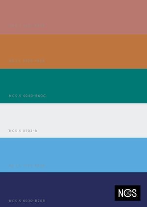
EVOLVING ELECTICISM
THE ENVIRONMENTAL IMPACT IS THE FAR MOST IMPORTANT CONCERN OF HUMANITY TODAY. WE ARE FORCED TO TAKE ACTION TO PROTECT THE ENVIRONMENT FOR THE FUTURE.
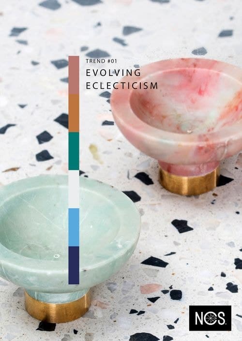
The public awareness of our environment has never been as widespread as it is today. There is a new consciousness about the importance of consuming responsibly, where sustainability lies at the core, not only for today, but also for the future.
There is an evolving eclecticism in which mass consumption is no longer adopted. Instead, we carefully choose what we want to keep based on its utility and unique features. Also, the products we purchase are made from recycled materials.
One of the most important materials in this trend is recycled plastic. Plastic is alreadu being used for fashion and interior design, but it has now evolved into an exciting new surface design element – the New Marble.
Evolving Electicism is a refreshing celebration of an environmental consciousness, creating a new type of luxury based on responsibility.
A circular approach is the primary driver in this interior trend of dominant bright blue and rusty red as we increase our environmental consciousness.
By combining new design techniques with used materials, exciting new interior treasures are created.
This trend is all about a mix of carefully selected novelties and vintage design, taking the best of different schools of interior design to create a new, hyper-modern touch.
The circular approach is key in this trend, creating colour combinations inspired by plastic, glass, leather, word and textiles, which are reflected in the colour palette. A combination of leading colours such as sharp blues and rustic reads with rich greens and blues as top notes, combined with unexpected accent colours of light blue and warm beige.
In the NCS COLOUR TRENDS 2019+ forecast, water was one of the dominating trends with colours that remind us of clean waters but also faded colours of bleached plastic.
Our general colour preferences for 2020+ are moving further in the direction of less chromatic colours to softer shades and faded hues. In Evolving Electicism, there is an evolution of the blues and greens, together with softer redish colours, which refer both to recycled and natural material as well as vintage leather and wooden material.
This is a group of colours in a similar nuance area, together with a balanced blue toned off-white and a deep redish blue colour.
SHADES OF INCOGNITO
SEAMLESS CONNECTIVITY HAS FOR YEARS CONTRIBUTED TO A DIGITAL OVERSHARE OF OUR LIVES. THIS HAS NOW EVOLVED TO INSTEAD EMBRACE OUR PRIVACY, AND THE SEARCH FOR WELL-BEING, TO LIVE OFF THE GRID AND GO INCOGNITO.
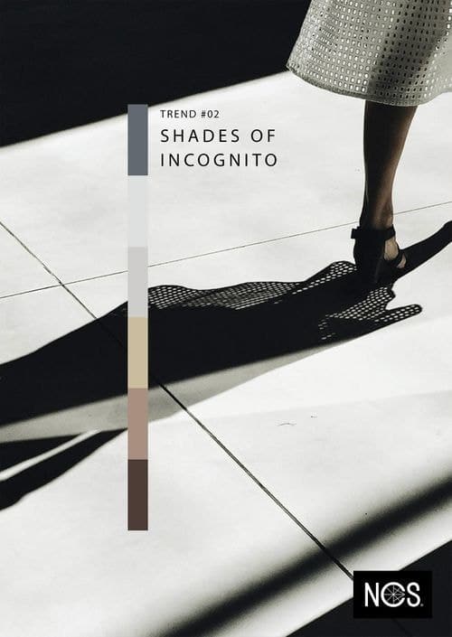
The enormous process of gathering data about our online behavior, lifestyles, choices and preferences is going on every second of the day. It’s all about big data and the evolution to smart data. As a result, the exposure of customized and targeted content and advertising online is part of our new reality. Hopefully, our data will not be used in a destructive way. But we can’t be sure of this.
Les données qui étaient autrefois activement partagées et autorisées ont maintenant été contrecarrées par le désir de passer plus de temps à l’ombre de l’incognito.
Alors que la vie privée est de plus en plus recherchée, de nouvelles lois évoluent et sont appliquées comme une étape importante pour la protéger.
However, the only way to become fully incognito in a world of big data is go to completely offline. We disconnect from all online connections so as not to be exposed to the risks of user-manipulated content – and we pass by incognito.
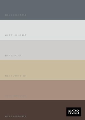
A soft gradient of browns and greys inspired by the desire for privacy rather than oversharing online. Big data gathering is making us want to go incognito.
Shades of incognito is a sanctuary from the digital way of living and a celebration of the analogue. Escaping into the shadows, this trend represents a new type of veil, mixing light and transparent material such as silk, smoke-coloured glass and linen, as well as creating a tranquil layered colour palette ranging from rich brown to warm beige and light grey.
Shades of incognito’s colours represent perhaps the clearest trend area that we are heading for, moving from a longer period of accepting and welcoming high chromatic colours, to moving towards the other extreme, the low chromatic, softer and more neutral colours.
The main driver influencing this trend is not only the desire for a more extensive personal integrity but also our increased climate consciousness.
All colours have a maximum of 10 in chromaticness, based in very whitish to very blackish shades and hues from opposite sides of each other in the colour circle. They are, per definition, complementary colours.
These similarities and complimentary features make this trend group very tranquil and soothing and therefore appealing to its cause.
NEW MASCULINITY
THE WORLD TODAY IS A PLACE WHERE WE REFUSE TO STAY PUT, AND IT IS AN ERA OF MOVEMENTS ALL ABOUT EQUALITY, HUMAN RIGHTS AND LIBERATION. TO BE YOU, WHOMEVER YOUR CHOOSE TO BE.
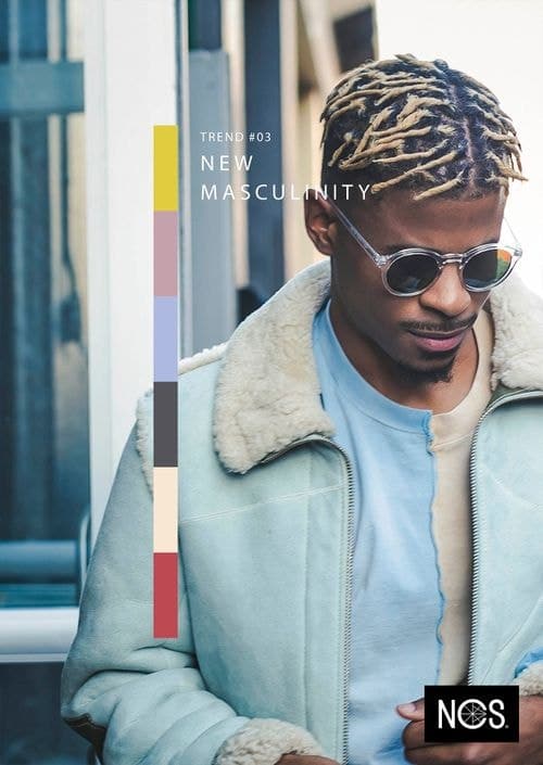
The search for equality has created important new movements globally, with the liberation of gender equality as one of the most massive. The new feminism has evolved and, with it, the rise of the new (hu)man, as the new masculinity.
While fighting for our rights as human beings, the traditional stereotypes are being questioned. The new woman is here and, together with a newborn masculinity, all boundaries between masculinity and feminity is gradually being erased.
A colourful parade of bright yellow and soft pastels that celebrates us humans, and to questioning the traditional stereotypes.
Women and men no longer stand in sharp contrast to each other. It is paradigm shift in which there is only one acceptance of who you prefer to be – as a human being.
New masculinity is a celebration to us as human beings. A playful trend that mixes soft textiles with hard metals, combined with interior details in different shapes to create a playful yet unexpected interior design. It is a colourful parade of bright yellow and soft reds, purple and blue inspired by the variety among us human beings. A cheerful gender-free style with colours that traditionally are not masculine.
It is a happy, positive and optimistic trend and it is the most chromatic colour trend for 2020+ with up to 60 in chromaticness. With yellow as one of the dominating colours, the trend celebrates the new man, the new human being.
It is a balance of the softer pastels with a blackish purple shade, which reflects the idea that men can still celebrate black leather but now with a slight purple tint.
As a bridge between the chromatic colours and the dark colours, there is a beautiful warm beige colour.
HUMAN IDENTITY
IN A TIME WHEN DIGITAL INNOVATION AND ARTIFICIAL INTELLINGENCE (A.I.) ARE RAPIDLY EVOLVING, HUMAN AND A.I. UNIFIED IS NO LONGER SOMETHING WE JUST SEE IN SCIENCE FICTION MOVIES, BUT HAS BECOME PART OF OUR LIVES.
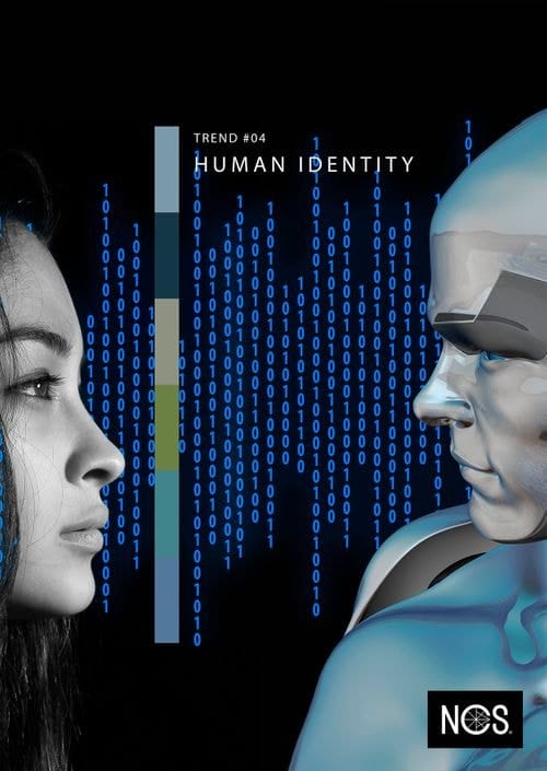
Smart products have slowly become a natural part of everyday life. It is discrete, embedded and designed to help, integrated into appliances, apparel and ourselves. An embedded merging of human and artificial intelligence that has made A.I. no longer a threat, but a partner in life, challenging and allowing us human beings to focus and develop our own intelligence.
A new type of human identity is created, merging human intelligence with artificial intelligence in the shape of an embedded digital layer that we invite into our homes – and even into ourselves.
Human identity is a statement about a unified intelligence tomorrow, emerge human and artificial intelligence to create a futuristic yet subtle design.
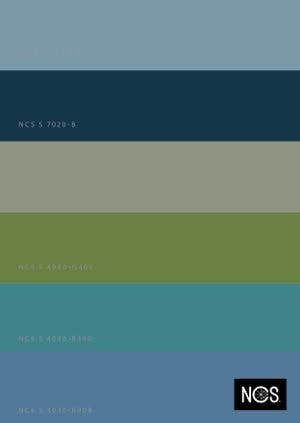
Shades of blue reflecting the embedded digital layer as human and artificial intelligence integrate and become one.
Combining hard materials such as stone with smooth suede, mixing glossy and matt surface applications, as well as regular forms versus irregular, to create an interesting expression.
The colours for human identity is a pure and clean blue green palette ranging from dark blue and muted greens to chromatic blue, reflecting one of the most important colour areas to come, but also the artificial intelligence that is already significant for a better tomorrow.
A pure energy that strives for a purer environment drives the blue and green shades further. The blue and green colours and midtones, situated in a similar nuance area. The dark blue shade and the more neutral blue-green shade make the nuance similar colour group both relevant and attractive.

